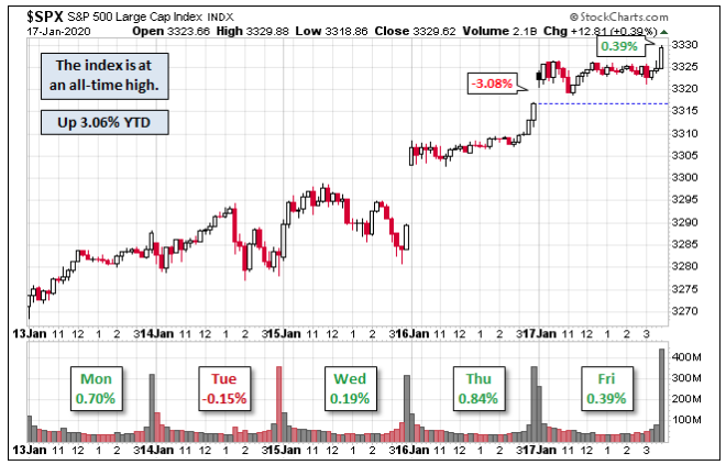
It was another strong week for the major averages. The S&P 500 (SPX) closed the second week of 2020 with another record high, closing at 3329.62. The index is up 3.06% already YTD and up 1.97% from last Friday. Thus far, for 3 consecutive years January has started off rather strongly.
Of course, the strong start to 2020 for equities isn’t appreciated by everyone. The strong start to the year in January 2019 was met with ample skeptics and permabears calling for a retest of the December 2018 lows, which took place on what is now known as the Christmas Eve Market Massacre.
Back in early 2019 we chronicled CNBC and Cornerstone Macro Research’s Carter Worth during the month of January and after what appeared to be a V-shaped recovery
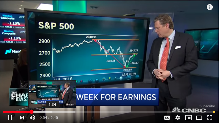
“On January 28, 2019, Carter Worth stated very clearly that he expects the market will return to test its lows from December 2018 and after a 50% retracement off the December bottom. What Worth’s charts couldn’t identify were the shift in gamma positioning amongst CTA’s, hedge funds and the like, which while proved minimal positioning at best, was still enough to create a Breadth thrust and Zweig thrust.”
I think it’s safe to say that not only was Carter Worth proven wrong and with great wanting, but it displayed his ongoing bearish bias toward the market, moreso than was ever appreciated by the CNBC audience. His bearishness only proliferated throughout 2019 with one of his Q4 2019 calls on the discretionary sector ETF (XLY). Almost immediately after suggesting investors should underweight the discretionary ETF, it did nothing but move higher, above $120 and to where it enters trading on Tuesday at roughly $127 per share.
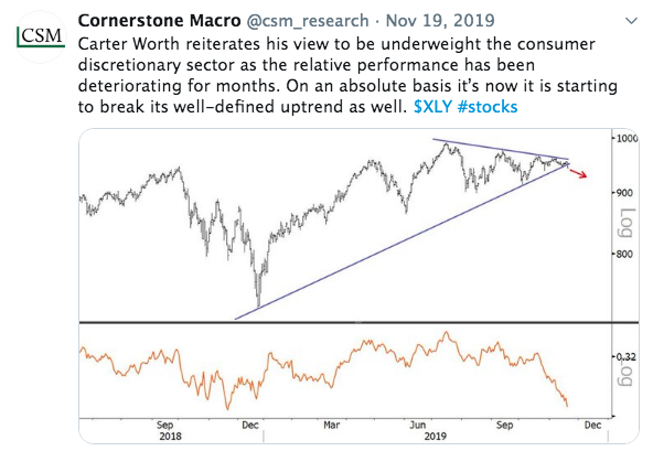
It was around the same time last year that Carter Worth was outlining the probability for a VIX-explosion in the market. Let’s be honest, many market participants were calling for another Volmageddon type of event back in November 2019 as record level non-commercial VIX Futures were sold short.
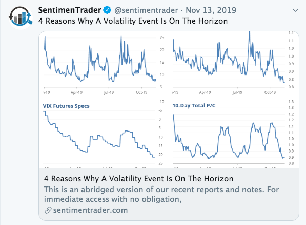
But like underweighting XLY, as Carter Worth offered then, this forecast or technical analysis didn’t come to pass. There was no “VIXplosion”.
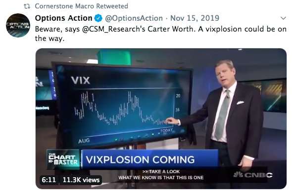
“The VIX is not making new lows as the market is making new highs, it’s holding more recent past levels. That coupled with record level short VIX futures as reported by the Commodity Commission (COT) is a set up for the market to go the other way (down).”
It’s actually becomes increasingly en vogue to lay claim around the next VIXplosion or Volmageddon 2.0 and since the February 5, 2018 actual Volmageddon event. The longer the VIX remains at relatively complacent levels, the more market participants seem to, and all of a sudden, happen on the reason or market signals that will cause another VIXplosion event.
Remember this VIX forecast from December, which was accompanied by a Q1 2020 equity market forecast?
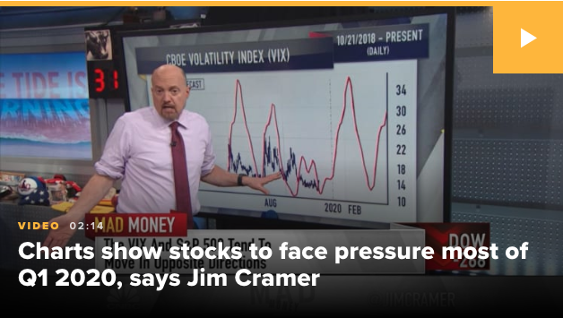
Of course, the Jim Cramer offering played out on his CNBC Mad Money show, and right in the middle of a mini market pullback in early December. What better time than to drive fear into the hearts of investors, right?
“The charts as interpreted by Larry Williams suggest that the market’s animal spirits are turning from bullish to bearish, at least for the next few months, and he thinks you should try to sidestep the pain here.
Right now, based on the volatility cycle, he’s anticipating a sustained upturn in the VIX, which tends to be very bad for the S&P 500. Based on his forecast, the volatility index should keep rising through Feb. 11,” Cramer said. “In other words, investors are starting to turn bearish here, and Williams expects them to stay that way for the next couple of months.”
Investors are turning from bullish to bearish huh? I’m guessing that’s why the market did and has done nothing but melt higher and achieved continues new all-time highs throughout December 2019 and thus far in 2020? And when looking at just net positioning in S&P 500 futures among asset managers and leveraged funds…
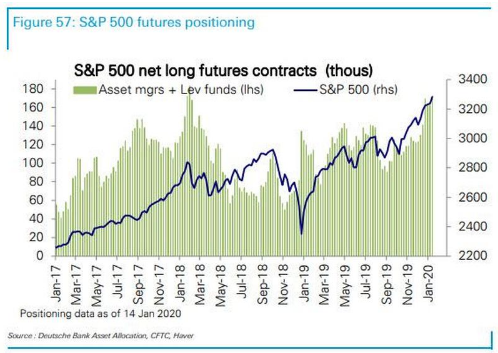
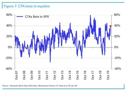
Does anybody see asset managers turning bullish in late 2019 based on futures positioning? Didn’t think so. And CTAs have had a higher beta to equities in the past, but this too has been rising fast since November 2019 and approaching the all time highs now.
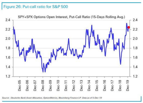
Last, but certainly not least, we don’t see equity put/call ratio levels like this when investors are turning from bullish to bearish, now do we? In what world does this guy Williams live in that Cramer decided to offer…
“We could have one more bounce before the negativity fully takes over, but he thinks you should use any strength to ring the register,” said Cramer. “I agree with him that we were due for a shakeout … and since I expect the president to raise his tariffs on China in two weeks, it might take a little while for the pain to unfold.”
So much for that tariff prediction to boot Jimmy! It’s so bad, it’s just so bad these predictions and analysis by the vast and pervasive media. With all that being said by Cramer and the grossly negligent characterization of investor sentiment and positioning by Williams, offered through Cramer, who knows whether or not the Q1 2020 prediction will come true; there is still time for that prediction. Having offered that “mulligan” to Jimmy and Williams and certainly wouldn’t come from the VIX failed prediction or the characterization of sentiment. Williams can be proven right for all the wrong reasons; it happens. In fact, the positioned charts concerning market leverage by institutional investors in and of itself suggests many fund styles are nearing peak leverage and a cause for concern should something panic markets near-term.
Moreover, don’t dismiss what we mentioned earlier; the longer the VIX remains docile the more VIXplosion-type articles will manage there way into the media. Here’s yet another from just 4 days ago.
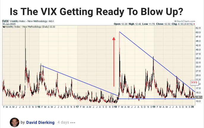
While finomgroup.com members have long since learned that using technical analysis on the VIX is fruitless and a big “no-no”, eventually someone is simply closest to the date of a VIX spike to make it seem like they called it. Maybe David Dierking is the lucky one this time around and after presented failures for such calls that came as early as April 2019. Shall we root for David?
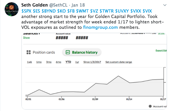
Finom Group Premium members are privy to our trade alerts and strategy dialogues in the Live daily Trading Room. This past week, Seth Golden outlined his actions for curtailing Golden Capital Portfolio short-VOL holdings in shares of UVXY. He also announced the execution of this on Twitter over the past weekend.
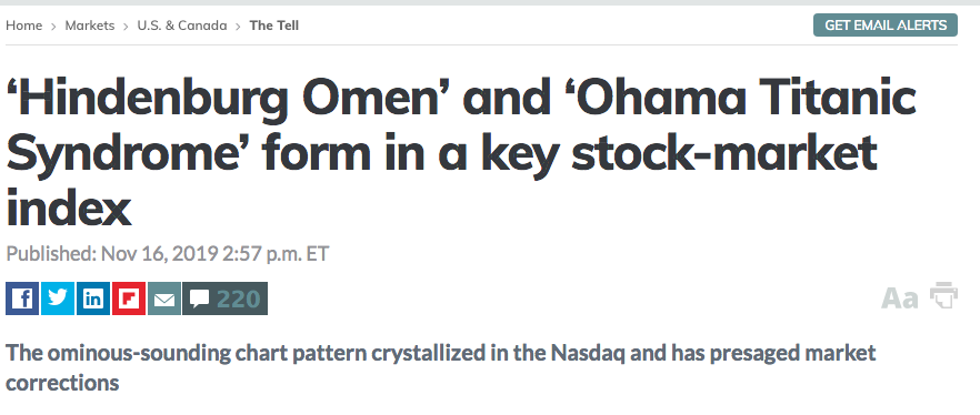
Failed market and VIX calls are a dime-a-dozen. Do you remember all of the Hindenburg Omens produced in November 2019? This was a favorite tweet from The Sentiment Trader back in mid-November 2019.
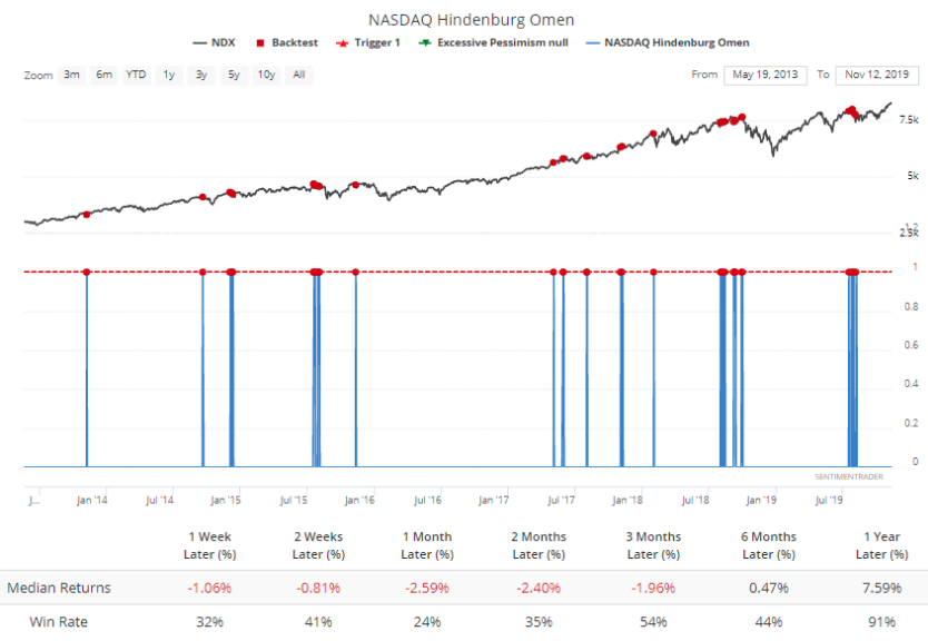

More than 2 months later and the ominous Hindenburg Omen has yet to produce any meaningful downturn in the market. This is not to suggest a market downturn won’t take place in the not too distant future, but rather it is highlighted to reflect on the practical relevance of such market “signals”. What should you have done back then as a trader/investor, hedge? Such a hedge would likely have proven a tax on your profits as the relentless market rally was further fueled by equity market inflows for 6 consecutive weeks.
So many thoughts and analytical positions on what and why the market does and/or should do are offered in the media on an hourly, daily and weekly basis. It’s quite dizzying! Most discussions concerning the market lend themselves to cautionary tales at this point and after a year where the S&P 500 total return was roughly 31%, and has gained another 3%+ in early 2020. Nonetheless, recall the more recent bearish call from The Sentiment Trader.
“The recent SPX rally has been relentless. The past 3 months have seen 26 days in which SPX was at a 1 year high (daily HIGH prices) Over the past 15 years, this ALWAYS led to a pullback in SPX over the next week.
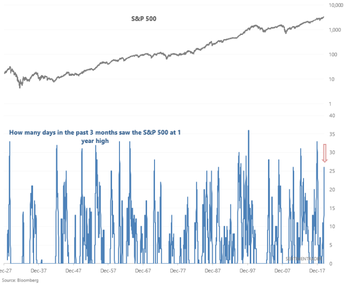
This call from the Sentiment Trader was based on nothing more than the historical data that fit the issued criteria. When this set up happened in the past, the market pulled lower each time… every time in the last 15 years and until this time. The notes from the Sentiment Trader on this study came on January 10, 2019, but the market rose nearly 2% last week and bucked the historic data. As we always say, “It’s good to know market probabilities going forward based on historic data, but history doesn’t ALWAYS repeat!” History did not repeat in this case!
We see people post charts on social media daily. Usually, these charts behave as a blank canvas would, begging of the viewer to rationalize and extrapolate meaning from the chart. So here are a few charts/tables we explored recently in order to deduce why this has been the longest expansion cycle in history. You judge for yourself how the longest expansion cycle in history came to be and whether or not it should be appreciated as we know many loathe this expansion regime due to the unprecedented central banks’ activities. In that same manner we would also suggest, the stock market doesn’t care whether or not we appreciate or loathe the “new economy”.
So here is a chart that identifies the components of the U.S. GDP, economic activity.
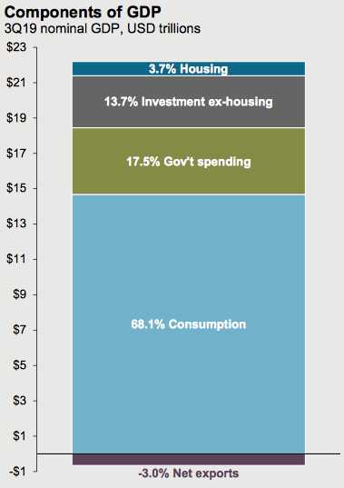
Notice anything interesting about the chart? The first thing that might jump out at you is that consumption, consumer spending is the main contributor of economic activity in the United States, and by a wide margin. Secondly, we don’t do a lot of exporting (-3%), but for the sake of oil. If it weren’t for the fact that the United States is ow a net exporter of crude oil, we wouldn’t even likely bother to focus on manufacturing metrics at all.
In total energy consumption, the US was between 86% and 91% self-sufficient in 2016. In May 2011, the country became a net exporter of refined petroleum products. As of 2014, the United States was the world’s third-largest producer of crude oil, after Saudi Arabia and Russia, and second-largest exporter of refined products, after Russia. In November 2019, the United States became a net exporter of all oil products, including both refined petroleum products and crude oil.
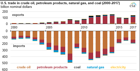
In early December 2018, it was reported that the U.S. had turned into a net exporter of oil “last week”, thus breaking nearly 75 continuous years of dependence on foreign oil. Reportedly, the U.S. sold overseas a net of 211,000 barrels a day of crude and refined products such as gasoline and diesel. This, compared to net imports of about three million barrels a day on average previously during 2018 and the prior annual peak of more than 12 million barrels a day during 2005, as confirmed by the US Energy Information Administration.
Going back to our GDP composition, it’s still a great wonder as to why folks spend so much time focusing on the ISM and PMI data that is delivered monthly. As a percentage of GDP, manufacturing does nothing but decline over time, as our consumer-driven economy is also dependent on price transparency technologies. And to that point, if you think the economy will somehow slip back into the old economic ways of consumer spending and retailing, think again. Businesses have only increased their IT and IP spending over the last decade and at the expense of old economy investments that centered on durable goods, orders that used to go to U.S. factories in part. This assertion is identified in the chart below from the Leuthold Group.
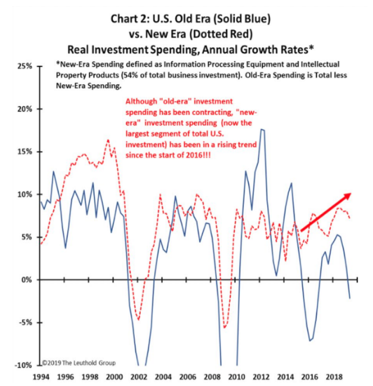
- The economy has shifted since the turn of the century. The chart above identifies the shift in spending by corporations which focuses on Information Processing Equipment versus prior periods where capital expenditures were aligned with hardware equipment, machinery and tooling.
- The Dow Jones Transport (DJT) had been a leading economic indictor, but the Semiconductor sector (SMH) may have taken over as chips are in most every computing and communication device.
We began this discussion denoting that this is now the longest expansion in history, which appears to have legs through 2020, at least. Most economists do not see a recession in 2020, according to the New York Federal Reserve Bank.
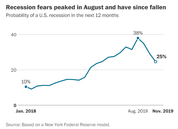
So here is another chart. The reason we like this chart is because it identifies a couple of crucial reasons for which the expansion cycle has become the longest in history.
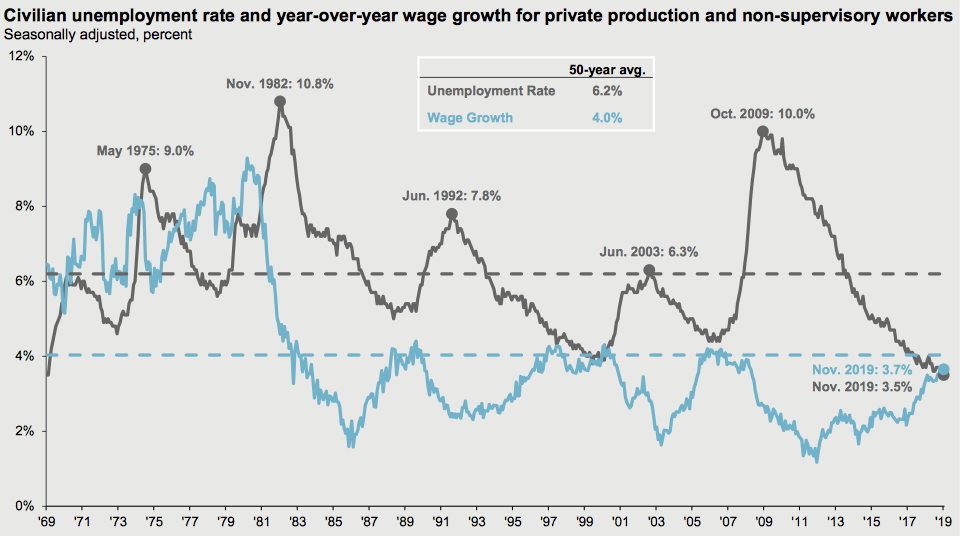
The duration for which wages have grown mirrors the duration of the expansion cycle. Wage growth (blue line) continues at roughly 4% and has grown through much of the expansion cycle. Moreover, it has accelerated since 2017 or upon passage of the Tax Reform Act of late 2017. The unemployment rate has also kept pace with real GDP growth as sales have grown throughout the expansion cycle, demanding ever increasing jobs.
Moreover, when wage growth is coupled with an elongated expansion cycle, the average household is afforded the opportunity to repair their balance sheet. And repair their balance sheet they have. The following cluster of charts from J.P. Morgan identify the household balance sheet.
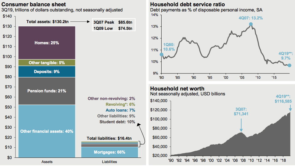
While net worth can adjust somewhat quickly from an exogenous shock to the economy, that is what is usually demanded to exact such adjustments to net worth. More importantly, however, is the chart of Household debt service ratio, which is at it’s best levels since the 1960s. To the extent many fault the national deficit and spending packages passed by legislature since the Great Financial Crisis and the Fed’s monetary policy, their abilities to extend the economic cycle have been to the benefit of the household balance sheet. So here are two more charts that we like, and why.
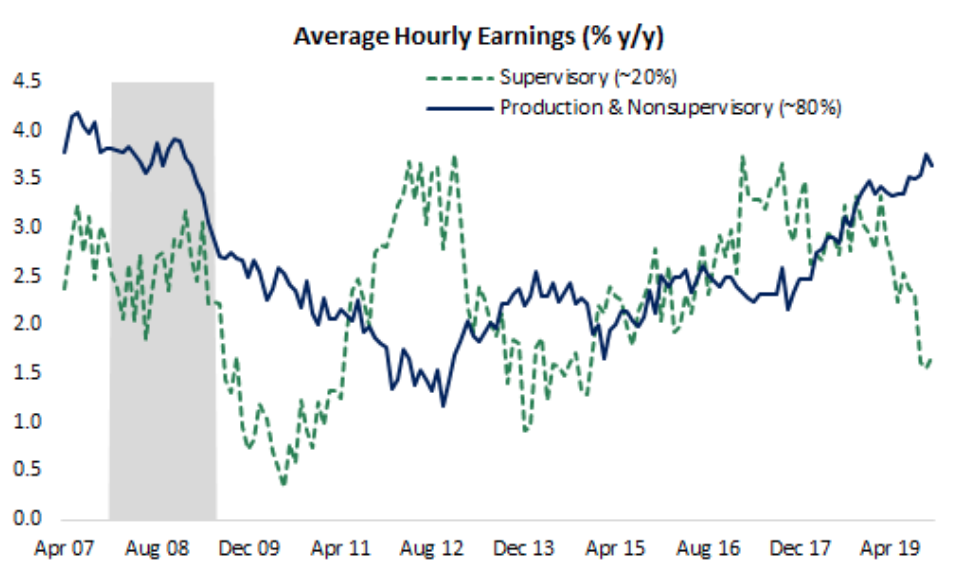
Breaking out supervisory (~20% of the workforce) & nonsupervisory workers(~80%) shows a notable deceleration in wage growth at the top tier. Supervisory workers make on average twice as much as nonsupervisory, but the pace of gains has slowed & roughly matches inflation. There is now a divergence between the two wage brackets and production and nonsupervisory worker wage growth has accelerated beyond that of where the lesser population is found. Why do we like that this has taken place at what can be characterized as the late stages of an economic cycle?
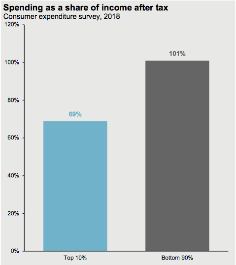
That’s why! the bottom 90% of wage earners spend more than the top 10% of wage earners. Ahhhhhhh! So these are just a few charts that we like and which are more macro-fundamental in nature. To the extent that we can look at and chart various sectors of the market, these charts/tables help to better identify the long-term probabilities for the economy and the equity markets.
If you’re a new investor or trader, you’ll soon come to find that all investors perceive a situation that can affect the entire market. Think back to how many times during this bull market that an analyst or a pundit told us that the Bond market was sending a message to investors. Of course this commentary/warning has more recently been pared with the warning that the small caps (Russell 2000 (RUT)) are sending investors an ominous message. Kind of like those Hindenburg Omens, right?
While some market pundits like to point out these warning signs to investors, they are largely in the moment commentary and lacking actual forecasts. To that point and with the small caps in mind, the small cap index ETF (IWM) is threatening to make a new all-time high. So much for all that bearish commentary that correlated the underperformance of small caps relative to large caps.

And least we not forget the whole Dow Theory warnings? We have all heard that the Dow Transportation average is projecting a slower economy. It’s not necessary to bore anyone with all of the details that show how immaterial all of that commentary has been. Nonetheless, such commentary is endless and it goes on like a never-ending drum beat.
None of the aforementioned commentary is bullish thumping or found casting prudent investing models out the window simply because the market has expressed a significant rally. The important takeaways here are rather simple and mirror that of what we said back in Q4 of 2018, “The market can remain oversold and overbought for longer than investors/traders care to realize… or even accept.”
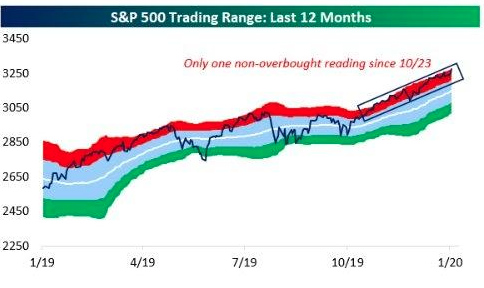
It’s now been 28 days since the S&P closed below its 10-day moving average. Bespoke Investment Group tells us the technical data has relayed that same message since October 23rd.
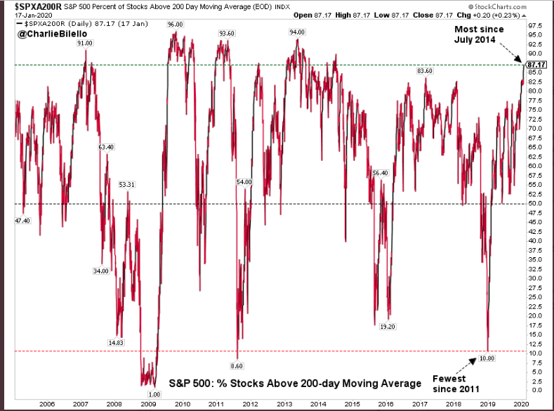
And if that’s not “overbought” and frothy enough sentiment for you, 87% of stocks are above their 200-DMA. This is, once again an improvement in breadth on a week-over-week basis. It also reflects the greatest amount of stocks above their 200-DMA since July 2014. And have we seen better breadth, the chart does answer that question, but also suggests the answer is “not much better” and “not for very long”.
It’s no secret the market is overbought any more than it is a secret that the market will eventually pullback and volatility will rise. These are simply inevitabilities. Just because these are inevitabilities doesn’t mean we are to be fearful of them, but rather embrace sound portfolio management practices in order to take advantage of a market pullback when it presents itself in an expansion cycle and while credit markets aren’t sounding any alarms whatsoever. Imagine if you had pushed the fear-driven narratives to the sidelines in Q4 2018 and early Q1 2019? Talk about your broad-based buying opportunities, or if you favor shorting volatility.
It seems like the media, social or otherwise, is littering the landscape of the markets with bearish narratives lately. From frothy, bubblicious markets to extreme valuation narratives, the bearish narratives are becoming more and more prolific as the market trends higher.
Greg Jensen, the co-CIO of Bridgewater, warned that he his fund was cautious on stocks, describing them as “frothy” as “most of the world is long equity markets in pretty extreme situations”, and predicted that gold would soar to $2000 and higher because the Fed and other central banks would let inflation run hot for a while and “there will no longer be an attempt by any of the developed world’s major central banks to normalize interest rates. That’s a big deal.”
Recall late last year all the hoopla surrounding Ray Dalio’s short, or not short bet on equities?
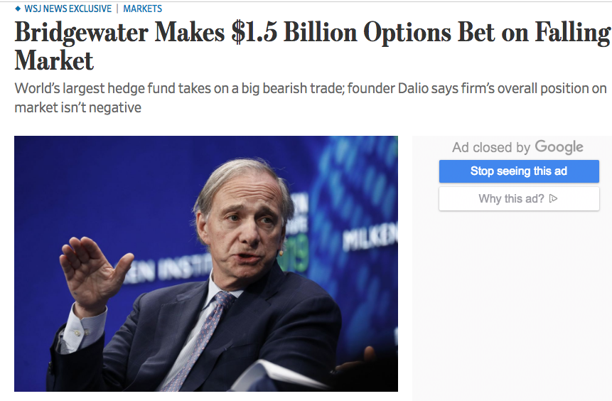
Dalio denied that the hedge fund was betting bearishly against U.S. equities shortly after the Wall Street Journal’s hit piece on the sizable position. But here’s the real point of rehashing the former and likely still in-play position with the co-CIO’s articulations on the market; Is Bridgewater talking its book? I would be of the opinion that most of these prominent hedge fund managers and founders are always talking their book. Heck, in a year where the S&P 500 was up some 31%, Bridgewater’s flagship Pure Alpha strategy was flat in 2019, while its All Weather fund gained just 16% for the year. Talk about your wild underperformance. Gurus aren’t always found for guru-type performance.
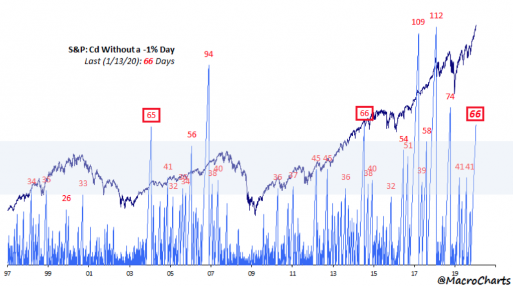
The recent market performance has been characterized by a notable calm and with the S&P 500 rising slow-and-steady to record level highs. The S&P 500 has not posted a 1% move in either direction since mid-October 2019, the 6th longest stretch in more than a half century. Additionally, the S&P 500 has not fallen 1% in 70 days or since October 9, 2019. Bespoke Investment Group recently noted, that even though this seems an extreme sentiment reading in the market, it has happened twice before in just the last 3 years. On two occasions, the S&P 500 didn’t decline 1% for more than 100 days.
As we look forward to the coming trading week, it’s clear that the greater the market valuation trends, the more market pundits and permabears will be stomping their feet/paws 
It’s been a couple of years since we last saw the S&P 500 PE multiple this high. The last time the PE was this high was in anticipation of the 2017 Tax Reform Act. The chart below of the S&P 500 PE ratio identifies the aforementioned and present time period and begs of investors to consider what happened the last time the PE became this stretched. But here’s the catch, as there is always a catch.
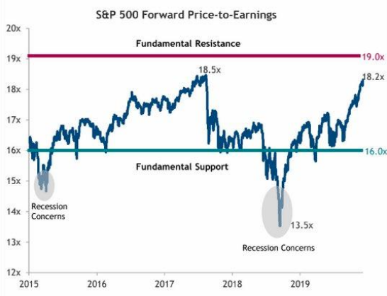
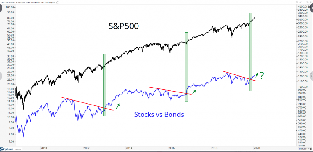
Shortly after the 18.5X multiple was achieved in late 2017, the Fed embarked upon a tightening cycle in 2018 that lasted the whole of the year. That’s simply not the case today, and rates are lower today than they were in 2018, re-enforcing equity valuations when compared to bonds. This is something more recently recognized in a chart of relative performance between the two asset classes and as offered by J.C. Parets.
It’s not hard to understand by now that investors and analysts alike are anticipating an earnings rebound. At present, the forecast for FY2020 earnings is growth of roughly 9.5% YoY. A low bar has been set from flat earnings in 2019. With that flat growth in a year that proved multiple expansion is alive and well, but found with tremendous bearish sentiment for the market’s rally, we think many market participants are overlooking the positive macro-backdrop for 2020 that wasn’t present going into 2019. Where we see tailwinds for economic growth and/or earnings in 2020, most are expressing recency bias and fear of multiple expansion. Finom Group is of the opinion that even with FY2020 EPS growth estimates of 9.5% presently, that may prove too low and more in keeping with the bias that pervaded flat earnings growth and a global economic slowdown in 2019.
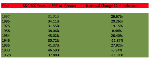
Secondly, it’s not like we are in unchartered territory folks. Yes, believe it or not we’ve actually been here before. Since 1950, the S&P 500 has been up >28% (as it was in 2019) six other times (not including 2019). The following year has been higher every single time, up nearly 19% on average. Here’s what the average year looks like under this scenario. (chart from Ryan Detrick of LPL Financial)
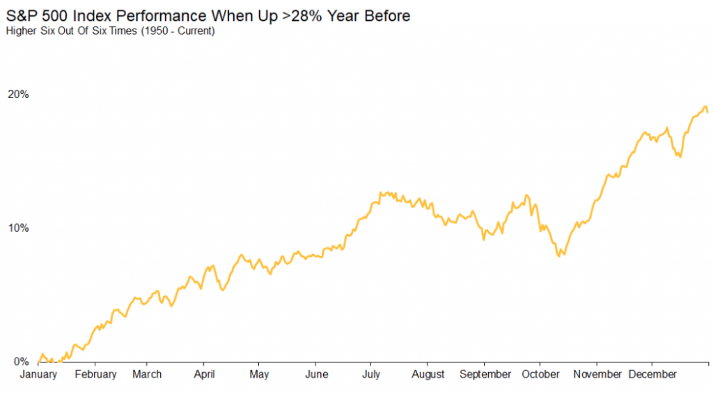
Last we checked, this is also an presidential election year… following a 28%+ S&P 500 year. Not sure why the media likes to propose greater fear during a presidential election cycle? Maybe it’s recency bias playing tricks on them once again. The market expressed a goodly amount of volatility and/or fear during the last presidential election cycle, but this was more about fears of a global economic slump and a long-awaited Brexit vote that found U.K. citizens voting in favor of Brexit more so than anything regarding the U.S. presidential election cycle of 2016. See what happens when we identify the details? Nonetheless, another chart identifying presidential election cycles and the average S&P 500 return.
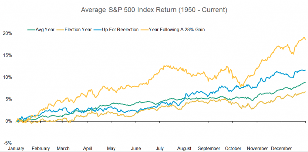
The blue line represents an election year where there is an incumbent up for reelection. As identified in the chart, whether w look at the blue line or the yellow line that identifies a year in which the S&P 500 follows a 28%+ gain, the odds look strong for another double-digit return in 2020. The S&P 500 may not travel higher in a straight line and history may not even repeat the average performance outlined in the chart above, but investors are armed with the probabilities based on history.
The market is never wrong! It’s never afforded that opportunity as the paradigm for the market is one of truth in pricing. The market goes up over time and as earnings provide the glide path. The market also has intermittent pullbacks, which afford investors an opportunity to by assets at a lesser valuation.
One doesn’t have to like or even appreciate why earnings trend higher over time. Be it through S&P 500 rebalancing and structural changes or the ever-hated corporate buyback programs that accelerated post the Tax Reform Act of 2017, earnings will travel higher over the passage of time. And speaking of those hated buybacks that apparently are one of the hated reasons for the market reaching new highs…
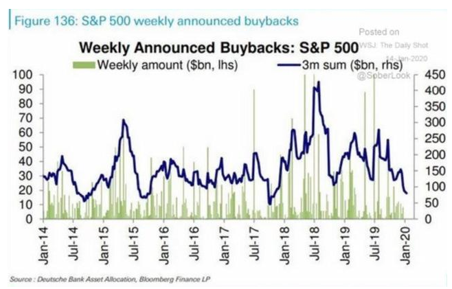
After 18 months of strong buyback announcements, it would appear the comps are too high to hurdle over for this particular aspect of open market operations. Nonetheless, it’s important to recognize these are simply announced buybacks, not actual buyback executions. Some existing buyback programs are found to have a duration of 2-4 years.
To put a pin in our rather longwinded soliloquy of market punditry, (oooh, that was a good one) for the holiday shortened trading week the S&P 500 weekly expected move is right around $30/points.

Remember folks, pullbacks are healthy and some might even say a necessary component for providing the bull with increased strength over the course of the year. While it may seem as if investors are leveraged “to the gills” fund flows suggest there’s a goodly amount of capital still waiting to be pulled from the bond and money markets, depending on earnings forecasts. And for all the naysayers and fund managers that consistently fail to at least market perform, kindly stop promoting the art of hedging that apparently is mastered by a total of… well nobody.


